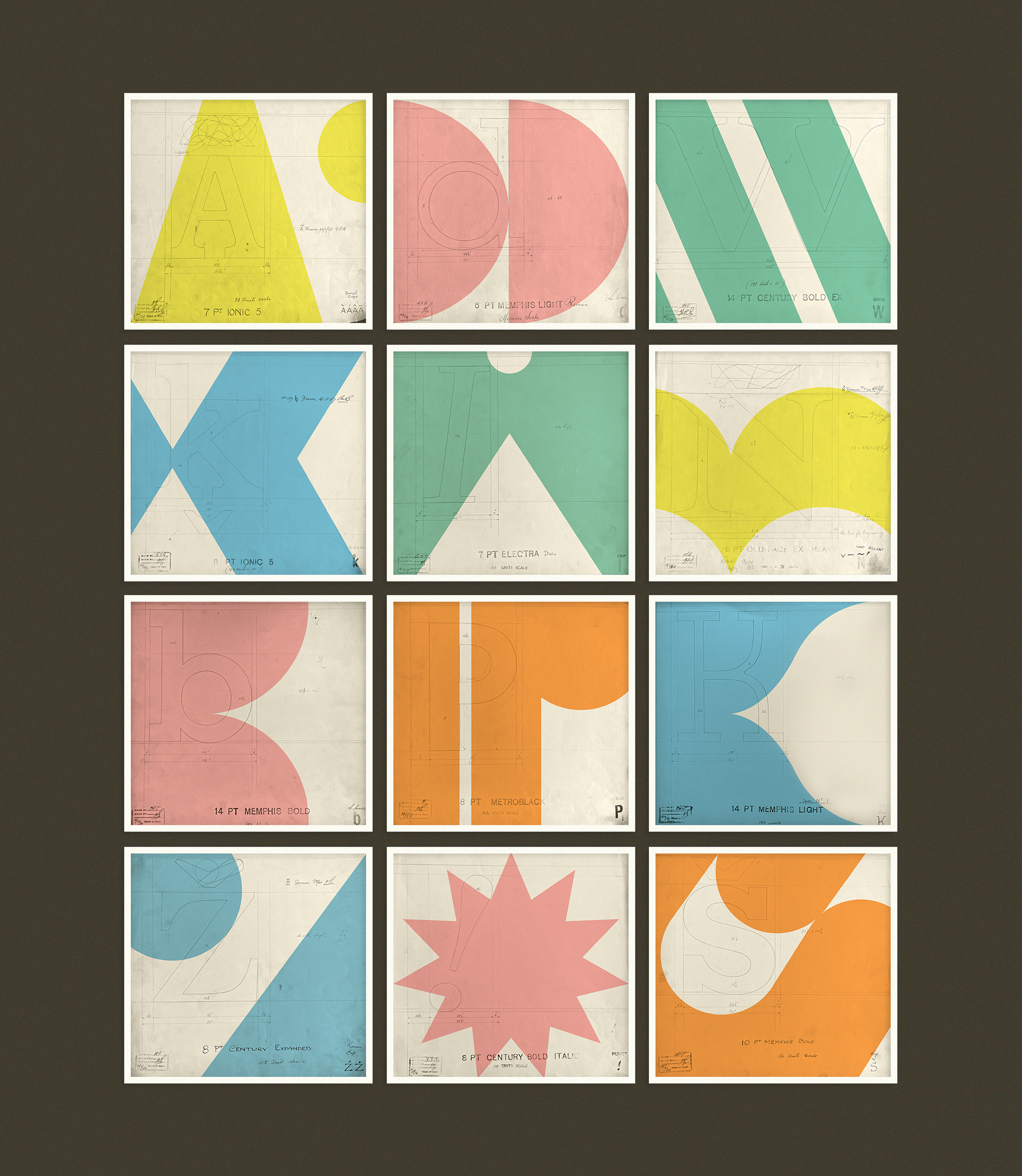
Alphabet
I was approached to add a colourful layer to these already beautiful typographic studies, originally found in a UK flea market some are dated at nearly 100 years old (?!). After the initial design development phase we landed on a more geometric approach, to contrast with the fine pencil.
Role: Art Direction, Design
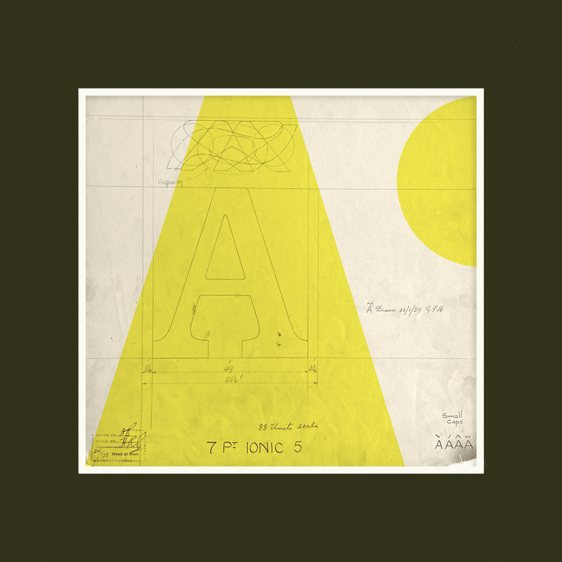

Each design was inspired by the letterform beneath, reduced but still capturing the feeling of each letter. As there is transparency with each print the relationship between the 2 layers was also considered.
After much exploration on the physical application of each design (transparent paper & acetate were also considered) we chose screen print as the best method. Printed at Oficina Loba studio in Lisbon.

...